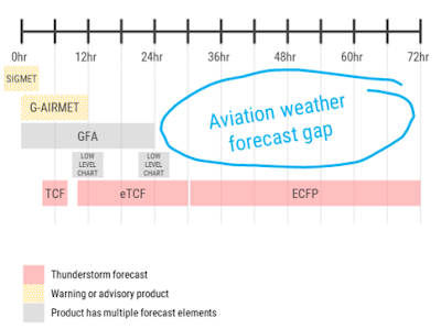
One of the major themes, or desks, of this year's experiment is looking at the potential for creating Outlook Graphics for Days 1, 2, and 3 for AWC's General Aviation (GA) customers. Current AWC operational products do not go out beyond Day1, leaving an information gap (Fig.1) for those that are looking to plan for flights in the coming days. AWC has continuously received feedback from their pilot partners that they would like to have an easy to interpret, quick glance graphic that gives them an idea of what hazards to expect in the coming days.
 |
| Fig1. Current aviation weather forecast gap at the Aviation Weather Center for aviation hazards. |
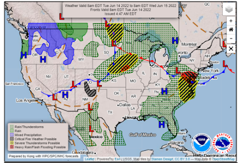
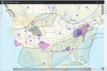
Experiment participants were tasked with developing Outlook Graphics that would be valid 12z-12z the following day and depict prolonged, impactful hazards which could include turbulence, IFR, icing, precipitation, smoke, and thunderstorms. The design would be similar to the current National Forecast Charts (Fig2) developed by the Weather Prediction Center, and maintain consistency with existing NWS products (ie. WPC, NHC, NDFD). Participants used an interactive drawing GUI on the Testbed Website that allowed them to overlay fronts, modify the background map, and draw various polygons for each forecasted hazard.
 |
| Fig2. An example of the Weather Prediction Center's National Forecast Chart for Day1. |
While ultimately user input will be critical for determining the utility of the Outlook graphics, participants were asked to fucus on things like the design, what guidance to use, what hazards were most impactful and should be included, and the overall workload that would be associated with creating such a graphic. It was clear from day one of the experiment that everyone brought different perspectives and ideas to the table, leading to an active and fun desk throughout the week.
 |
| Fig3. An example of one of the Outlook Graphics created during the experiment. |
Throughout the week all participants agreed that determining the severity and impact of the graphics for the GA community will be the top priority before moving forward with operationalizing the product. Participants also indicated that a more detailed summary of the impacts with location and timing associated with them would be beneficial for Day1 for both GA fliers and fellow meteorologists. Other ideas that were brought up were the potential for multiple outlook 'tabs' for the various user types (GA, Low Altitude (LA), and National Air Space (NAS) planning), or even breaking up Day 1 into two separate Outlook graphics (morning and afternoon) to account for hazards that are only impactful during those periods.
In the end, the AWT staff recieved an abundance of perspective and ideas for moving the Outlook Graphic further toward operations. The next step will be to get the graphic in front of users to really assess the intuitiveness and utility of the product for its intended users.
No comments:
Post a Comment