Showing posts with label HRRR. Show all posts

Tuesday, August 11, 2020

Verification and Reliability of Probabilistic Information

When evaluating a product to determine it's usefulness, it is important to know how well it is performing. Verifying probabilistic information is a tricky problem. It's much easier to validate a deterministic product by looking at observations of what occurred. For this evaluation, we're offering two methods for users to utilize to look at how well the probabilistic information performed. 

The first option allows for overlaying “observed” TCF polygons on past runs. These polygons are generated from MRMS reflectivity and echo tops over the entire 24 hour period. This verification product is available on the AWC main website via the TCF page. To get a sense of what these polygons look like with the corresponding MRMS reflectivity, check out the graphic below. 

An example of the MRMS polygon verification product, showing how the polygons are generated around MRMS reflectivity that meets the TCF criteria.

The MRMS option is intended to serve as a subjective verification, of sorts, comparing how the guidance performed against observations. The polygons are color coded by valid times that occur during the 24hr period represented by the guidance probability contours. An example of what this looks like can be seen in the graphic below, with the MRMS generated polygons overlaid on top of a past HRRRe 24hr graphic.

An example of the TCF probabilistic HRRRe 24hr graphic overlaid with "observed" MRMS polygons from the same time period. 

Another way users can get a sense of how well the probabilistic product performed is by overlaying the final 4-hr TCF polygons generated by the AWC forecaster throughout the 24hr period. The Final 4-hr TCF option is intended to allow for comparison between the performance of the automated probabilities and the forecaster generated polygons, allowing users to see if there are areas that were captured by the forecasters, but not the probabilities, or vice versa. An example of this can be seen below.

An example of the TCF probabilistic HREF 24hr graphic overlaid with the Final 4-hr TCF polygons color coded by valid time.

In addition to overlaying observed data onto the probabilistic information, users can also look at the reliability of each guidance product (HREF & HRRRe) by model run. The reliability statistics are computed and plotted for each guidance run using TCF polygons generated from MRMS reflectivity and echo tops as observations. These reliability diagrams give an assessment of the performance of probabilistic guidance in terms of its reliability, or whether the probabilities tend to over-predict or under-predict the occurrence of a phenomenon. 


In the above example, both models performed fairly well for this run, staying close to the center diagonal line which would indicate a perfect forecast. In this case, the HREF slightly over-predicted the probability values while the HRRRE slightly under-predicted the probability of occurrence. While this capability is currently only available by run, AWC plans to combine full statistics to get a better sense of overall performance during the experiment and beyond. There has also been early feedback indicating users would also like to see this information broken down by region.

While probabilistic information continues to be a challenge to fully verify, users seem to appreciate the various methods AWC has explored to give them a sense of model guidance performance and reliability. Other potential means to discern this information has been a topic of discussion among participants and stakeholders throughout the experiment thus far.


Thursday, August 6, 2020

The 2020 Summer Experiment Has Gone Virtual!

Like so many other things in 2020, the Summer Experiment has gone virtual! While we sure do miss seeing and interacting with our partners and stakeholders in the testbed, we are excited to be able to keep the tradition going by continuing to evaluate and evolve products for the aviation community!


In order to facilitate an evaluation in the virtual realm, we are focusing on one product with a more targeted participant list. In keeping with one of the themes from recent experiments, we're focusing on convection in the next-day planning regime. For that reason our targeted participants include forecasters from the various Center Weather Service Units (CWSU) which are co-located within the FAA's Air Route Traffic Control Centers (ARTCC). These forecasters often collaborate with Aviation Weather Center (AWC) forecasters on the Traffic Flow Management Convective Forecast (TCF) creation and have a breadth of knowledge on how convection impacts planning in the National Airspace System (NAS). 

Map of CWSU coverage areas over the contiguous United States.


While we have looked at the idea of impact graphics for utilization in longer term planning for the NAS, this time we are bringing in probabilistic information to address uncertainty and start to better understand how this information can best be used in the planning environment.  For this evaluation, we are utilizing convective allowing ensemble guidance to diagnose the probability of convection exceeding TCF criteria. 

An example of the TCF Probability graphic highlighting the probability of sparse coverage of convection


Guidance imagery, depicting the probability of exceeding sparse and medium coverage TCF thresholds, will be automatically generated from two different model sources twice per day, in the early morning and early afternoon. Evaluation of the guidance by participants will help us meet the following goals

  • Assess the usefulness of 24 hour summary information of TCF focused threats
  • Identify optimal ways to provide, interpret, and communicate probabilistic convective information
  • Assess the skillfulness of convection allowing ensemble systems for aviation focused convective forecasts
To help facilitate gathering feedback from our participants, we are once again partnering with the FAA's Aviation Weather Demonstration and Evaluation (AWDE) Services group.  Throughout the week they will help us assess the usability and utility of this product from the user's perspective via one-on-one interviews and a questionnaire. We will also have two large group discussions during which additional stakeholders will be invited to provide their perspective and input. 

Stay tuned for early results and key takeaways from the experiment!

Wednesday, August 21, 2019

Evaluating 3D Cloud Guidance

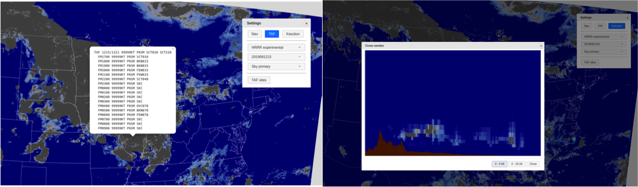
One of the focus areas for this year's experiment is evaluating three-dimensional cloud model guidance.  Participants are assessing current post-processing algorithms of cloud layers and the added benefits of experimental visualization capabilities.  In order to complete the evaluation and carefully assess the different guidance products available, the participants have been tasked with creating a detailed text forecast for five specific hours: 15Z, 18Z, 0Z, 9Z, and 12Z the next day.


In order to get a better visualization of the 3D cloud information, AWT developed a web interface that allows for better interrogation of the data.  The web interface displays the post-processed gridded output from various model guidance options including three cloud bases and corresponding sky coverage for each forecast hour from the the latest several model runs, as well as the model derived ceiling and visibility.  In addition to the single layer look at the information, the tool allows for creating point-and-click TAFs as well as cross-sections of the cloud layer information along a path.


Along with the descriptive cloud forecasts, the participants will be answering questions about the performance of the various guidance products, any notable strengths or weaknesses, and any biases identified as well.  The various guidance products available include experimental versions of the HRRR and RAP models, the NAM and NAM Nest, and the HIRES ARW, MEM2, and the NMMB.  The experimental 3D RTMA is also available for use as a cloud layer analysis for verification purposes. 


After day one, it was clear that the cross-section ability has several advantages and could be useful for multiple users. While it may not be the primary tool used to forecast ceilings, they could prove beneficial to bolster confidence in a cloud layer occurring or in seeing a thin low cloud deck or fog.  Forecasters may not have the time to look through multiple cross sections for multiple forecast hours, however they could use it to confirm a secondary layer or get a better idea of what the model is trying to tell them in terms of the cloud development.  However, pilots may find the tool extremely useful for planning along a flight path, especially if there could be a time element added in which conditions match the time in which they expect to be flying through that region.

In terms of model performance thus far, participants have been impressed with the HRRRx cloud placement in the vertical more accurately hitting the cloud bases and coverage.  This verified well on Day 1 with the stratus off the coast of California and cloud placement in the north east associated with late afternoon convection.  Overall, so far it seems the guidance tends to agree with cloud occurrence and conditions, but differ on timing and placement.

The experimental HRRR cloud base primary indicating low ceiling moving into the Sacramento valley via the delta breeze. 


Evaluations will continue through the week with specific areas of focus being determined each morning based on impacts for that day and the next.